By hand
by Bill
(link to this post)
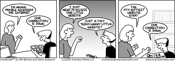
During clinical trials when the patients start dying off in droves the trial will be halted. That's what happened here. The feedback on the (very short) computer lettering experiment was almost uniformly negative. People admit that it's easier to read but they don't feel the font fit the strip. I don't disagree, though I've looked far and wide for one that does. I don't like my own lettering enough to make a font of it, but maybe I can be convinced.
In the meantime I'm taking steps to make it clearer and more professional looking. I'm lettering larger with a thicker brush, and using an elipse template to draw the bubbles. Please continue to let me know what you think.
This Unshelved strip
can be shared with this link.
