Inside The New Unshelved
We’ve gotten lots of questions about Unshelved’s new look. Why did we do it? And what, exactly, did we do? So here, without further ado, is a special behind-the-scenes tour for your eyes only.
Gene and I spent the last year reading old Unshelved comics and recording our conversations about them. The more we read, the more we were able to see how the strip has changed over the years. Without meaning to, we drifted away from the long storylines that gave us all a chance to get to really enjoy and explore our characters. We miss them!
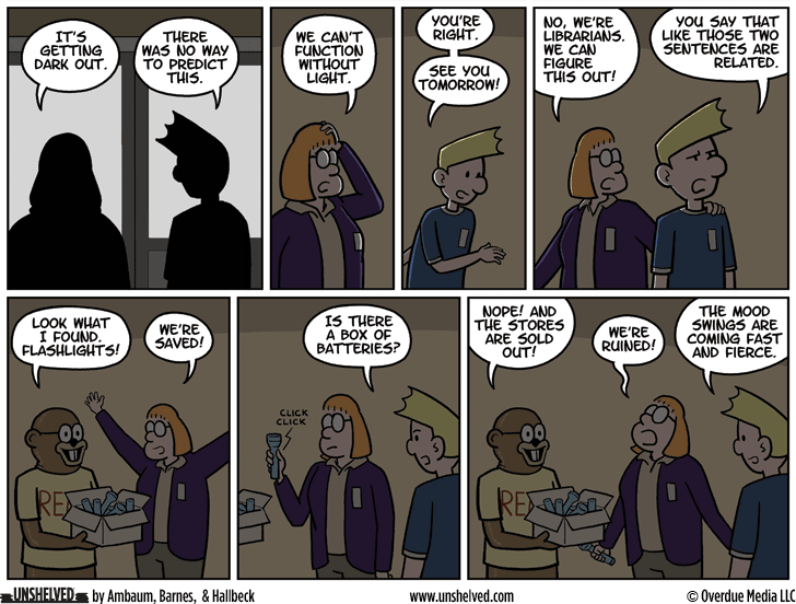
So we decided to get back to basics. We started writing more like we used to, with long discussions (i.e. arguments) about plot lines and character motivations. This month you’re seeing the first fruits of our labor, as Mel decides to keep the library open when Mallville is plunged into darkness. We’re having a lot more fun already, and we hope you are too.
Then there’s the artwork. I’ll be honest: I’ve been drawing the strip for fourteen years, and frankly I need a break. The obvious choice for a replacement artist was our friend Chris Hallbeck, who has been kicking butt as our official guest artist for over a year. He and I spent several weeks on new character designs that take cues from both our styles. We also made a 3D model of the library so that we could have a variety of camera angles and more detailed backgrounds. Finally, we adopted a larger standard format so that we have more space to work in.
Change can be hard, but we’re confident that soon enough all this new will feel normal. Thanks for sticking around while we figure it all out.
This Unshelved strip
can be shared with this link.
